
The MangoesToMetro order form is the part of the site that earns money. Everything else on the page is decoration.
So while I was building it, I kept asking one question: can everyone actually use this?
If someone cannot finish the form, that is not a bug report. That is a lost customer who wanted to buy mangoes.
What “accessible” actually means
“Accessible” sounds vague, so here is the plain version. The form has to work for someone using only a keyboard, with no mouse at all. It also has to work for someone who cannot see the screen and is listening to a screen reader. That is software which reads a page out loud.
WCAG 2.1 AA is the published checklist for this. It comes in three levels: A, AA and AAA. AA is the level most organisations aim for, so that is the one I targeted.
This post is not the checklist. It is what I actually wrote.
Rule one: use real HTML first
The biggest lesson is short. If HTML already has an element for the job, use it.
It is tempting to build buttons, dropdowns and selectors out of <div> elements and JavaScript. You get to style them exactly how you want. You also get something that works only for people with a mouse.
A real form element already knows how to do things a <div> never will. It can take keyboard focus. It announces what it is. It submits with the form. You get all of that for free.
Almost everything below is that one idea, applied again and again.
The delivery area picker
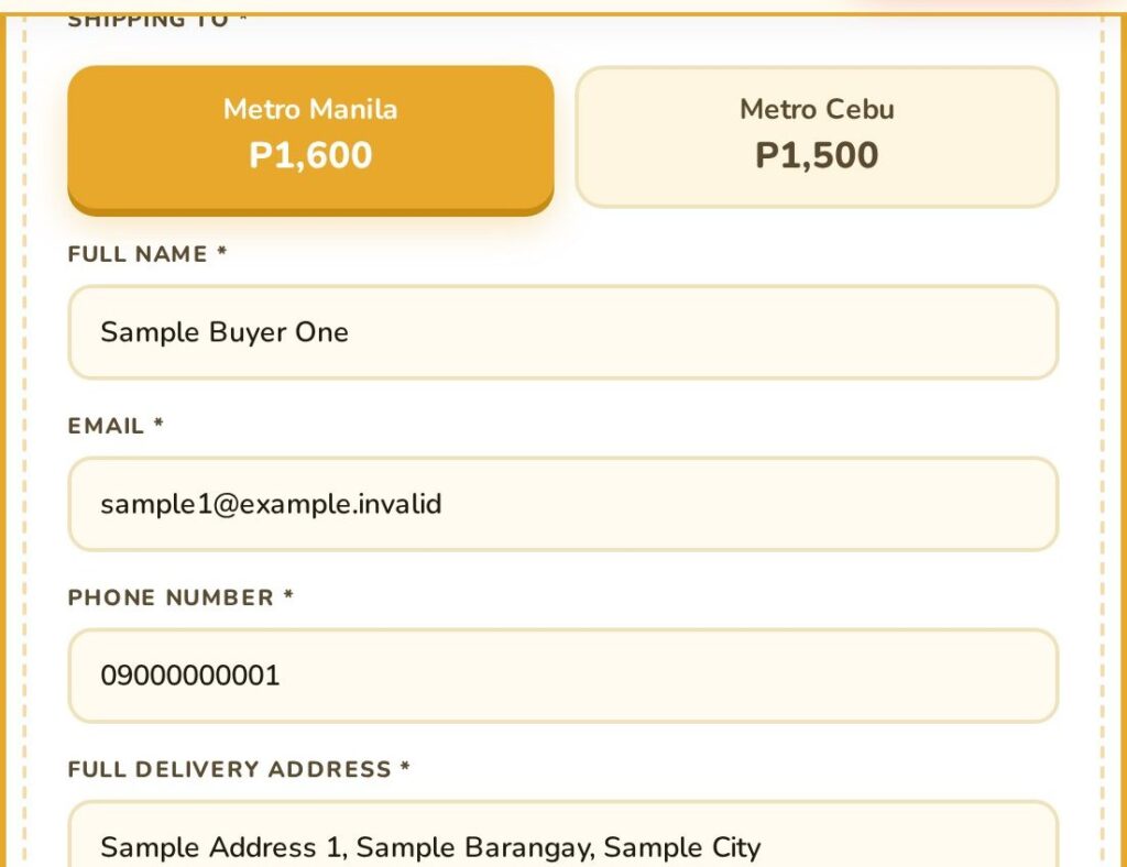
The buyer chooses Metro Manila or Metro Cebu. On screen it looks like two large tappable cards with the price on each one.
The obvious way to build that is two <div> elements with click handlers. It works with a mouse and fails for everyone else.
I used real radio buttons instead.
First, a word you will need. A radiogroup is a set of radio buttons that the browser treats as one control rather than several separate ones.
Using real radios gets you three things without any JavaScript. Arrow keys move between the options. Only one option can be selected. And a screen reader announces the group along with your position in it: “Shipping to, Metro Cebu, option 2 of 2”.
Here is the markup:
<fieldset role="radiogroup" aria-labelledby="dest-legend-label">
  <legend id="dest-legend-label" class="form-label">Shipping to</legend>
  <div class="dest-toggle">
    <label class="dest-option dest-option-label">
      <input type="radio" name="delivery_destination"
             id="dest-metro-manila" value="metro_manila" class="sr-only">
      <span class="dest-name">Metro Manila</span>
      <span class="dest-price">P1,600</span>
    </label>
    ...
  </div>
</fieldset>
Four parts are doing the real work here.
The <fieldset> says these options belong together. Without it, the grouping never reaches the screen reader.
The <legend> is the name of the group. It is why the announcement starts with “Shipping to” instead of just reading out two prices.
The class="sr-only" sits on the <input>, not on the card. More on that in a second.
And the <label> is the card. Everything the buyer looks at sits inside it, so the whole card is clickable.
You may have spotted role and aria-labelledby in there. Those come from ARIA, a set of attributes whose only job is to describe an element to assistive technology. They change nothing on screen.
Hiding something without deleting it
The radio buttons are invisible, because the cards are the design. This is where a lot of people go wrong.
There is a big difference between hidden and removed.
display: none removes the element. It drops out of the accessibility tree, which is the parallel version of the page that the browser hands to a screen reader. That tree lists what each element is, what it is called and what state it is in. Once an element is gone from it, nothing can focus the element and no screen reader learns it exists.
The .sr-only class (“screen reader only”) hides it visually and keeps everything else:
.sr-only {
  position: absolute;
  width: 1px;
  height: 1px;
  padding: 0;
  margin: -1px;
  overflow: hidden;
  clip: rect(0, 0, 0, 0);
  white-space: nowrap;
  border: 0;
}
The element is squeezed down to a single pixel and clipped to nothing. Nobody can see it. But it is still rendered, still focusable, and still in the accessibility tree.
That distinction is the whole trick, and it comes back again with the file upload.
Hiding the input this way does create one problem. The outline a browser draws to show keyboard focus would land on something invisible. So draw the focus style on the label instead:
.dest-option-label:focus-within {
  outline: 3px solid;
}
Skip that step and you have built a control that keyboard users can operate but cannot see themselves using.
The quantity stepper
The quantity control is a minus button, a value, and a plus button.
Custom steppers are a classic place to strand a screen reader, and it is usually the value in the middle that does it. If that value is a styled <div>, the browser sees no value at all. A screen reader will read the digit, but nothing tells it the digit is a quantity, or where it stops.
So the value here is a real number input:
<div class="qty-stepper" role="group">
  <button type="button" class="qty-minus"
          aria-label="Decrease quantity">−</button>

  <input type="number" id="qty-input" name="quantity"
         value="1" min="1" max="10" step="1"
         required aria-required="true">

  <button type="button" class="qty-plus"
          aria-label="Increase quantity">+</button>
</div>
Same rule as before. Because it is a real <input type="number">, the browser already knows this is a value, and min, max and step already describe the allowed range. None of that has to be explained by hand.
That max is not typed into the template either. It comes from the plugin’s configured limit, so the number a buyer is allowed to pick and the number the site enforces cannot drift apart.
The buttons do need help. A button whose only content is + may be announced as nothing more than “button”. Punctuation is often skipped entirely, so at worst it is announced as nothing at all. aria-label replaces the symbol with a proper name, which is why these read as “Increase quantity” and “Decrease quantity”.
The wrapper carries role="group" so the buttons and the field are presented as one unit rather than three unrelated controls.
The file upload
This was the hardest control on the page.
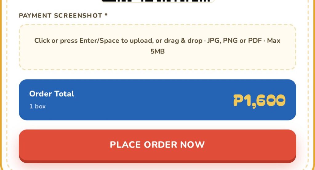
Buyers upload a screenshot of their payment. The design is a modern drag-and-drop zone, and a drag-and-drop zone is the classic way to build something only a mouse can use.
The fix is the same idea as the radio buttons. Keep the real <input type="file">, hide it with .sr-only, and make the drop zone a <label> pointing at it:
<label class="file-upload-label" for="payment-screenshot">
<input class="sr-only" type="file" id="payment-screenshot"
name="payment_screenshot" accept=".jpg,.jpeg,.png,.pdf"
required aria-required="true">
<div class="up-text">
Click or press Enter/Space to upload, or drag & drop
</div>
</label>That gives you the whole interaction for free, and the reason is worth knowing.
When a label is bound to a control, the browser passes the label’s activation through to that control. Click the label, the browser clicks the input, the file picker opens. That is native behaviour. No JavaScript.
The keyboard route works because the input is still there and still focusable. Tab to it, press Enter or Space, and you get the same picker.
One more thing, and it is not code. The visible text reads “Click or press Enter/Space to upload, or drag & drop”. Telling people in plain words that the keyboard works is worth more than any amount of ARIA.
Error messages: interrupt, or wait?
A screen reader reads the page in order, starting from wherever the user currently is. So anything that appears after the page has loaded is a problem. The user is somewhere else on the page and will never know it happened.
A live region is the fix. It is a container you mark up in advance, which the screen reader then watches. When the text inside it changes, the change is announced, without the user having to go and find it.
There are two kinds, and picking the wrong one causes real problems.
Errors interrupt. Validation errors use role="alert". The screen reader stops what it is saying and reads the message straight away, because the user has just done something they need to fix.
<input type="tel" id="order-mobile" name="mobile"
       required aria-required="true"
       aria-describedby="err-mobile">

<div class="field-error" id="err-mobile" role="alert"></div>
The form has seven of these: one for each of the six validated fields, plus one for the form as a whole.
Notice aria-describedby on the input. It names the error element’s id, which ties the message to the field it belongs to. Without it, the error is announced as a stray sentence floating somewhere on the page. With it, the screen reader reads it as part of the field.
Status messages wait. Informational updates use aria-live="polite" together with aria-atomic="true".
“Polite” means it waits for a natural pause instead of cutting across whatever is being read. “Atomic” means the whole region is re-read rather than only the words that changed, so someone hears “3 boxes” and not a bare “3”.
Getting these two backwards is one of the most common accessibility mistakes in forms. A polite error gets quietly missed, and the user never learns why the form will not submit. An interrupting status message makes the form feel like it is shouting.
Required fields need more than an asterisk
Most sites mark required fields with a star:
Full Name *The star is fine, but it is a visual convention. It does not reliably tell a screen reader anything.
So every required field also carries aria-required="true". Keep the star, add the attribute. Neither one replaces the other.
Animation should be opt-in
The site has scroll animations and transitions. Some people need them gone, because movement on screen causes nausea, dizziness or migraines.
Operating systems already ask. It is “Reduce motion” on macOS and iOS, and “Show animations” on Windows. The browser passes that answer through to CSS as the prefers-reduced-motion media query.
What is left is deciding which way round to write the test, and it matters more than it looks:
@media (prefers-reduced-motion: no-preference) {
  html { scroll-behavior: smooth; }
}
This adds motion only when the user has not asked against it.
The other way round is to animate by default and strip it out inside a reduce block. For anyone who has actually chosen a setting, the two behave identically.
They differ for a browser that reports nothing, either an old one or a platform with no such setting. Written this way, that person gets the calm version. Written the other way, they get every animation.
Motion should be opt-in, not opt-out.
Never delete the focus ring
The focus ring is the outline the browser draws around whichever element currently has keyboard focus. If you navigate with Tab, it is the only thing telling you where you are.
Designers often dislike how it looks, so this is everywhere:
outline: none;Every one of those is a keyboard user losing their place on the page.
My rule is mechanical. Every outline: none is paired with a :focus-visible style that puts a clear ring back. The stylesheet has fifteen of them, which is roughly how many times the instinct to remove it came up.
button:focus-visible {
  outline: 3px solid;
  outline-offset: 2px;
}
:focus-visible rather than :focus is what makes this acceptable to the design side.
:focus matches whenever an element has focus, including after a mouse click. That is exactly why removing the ring is tempting: it turns up when nobody needed it.
:focus-visible lets the browser decide, based on how the focus arrived. Click a button with a mouse, no ring. Tab to it, ring. Everyone gets what they need.
Labels, not placeholders
Avoid this:
<input type="email" placeholder="Your email">A placeholder is not a label. It disappears the moment someone starts typing, and the person most likely to forget what a field was for is the one who paused halfway through filling it in.
Placeholder grey also fails colour contrast requirements in most designs, because grey is grey for a reason.
Use a real label:
<label class="form-label" for="order-email">Email Address</label>
<input class="form-input" type="email" id="order-email" name="email">
The connection is the for attribute, and it has to contain exactly the input’s id. Get that string right and the browser treats the two as one control. That single match is what gives you the announced field name, the clickable label, and the forwarded click the file upload depends on.
Placeholders are still useful as an example or a hint sitting alongside a real label. Just never as a replacement for one.
The admin login counts too
Accessibility work usually stops at the public site.
But the team signs in far more often than any single customer visits. So the custom WordPress login page got the same treatment: proper labels, visible focus styles, and the same reduced-motion handling.
Accessibility covers the whole site, not only the pages customers see.
What did all this cost?
Honestly, not much.
The radiogroup and the file upload were the only two patterns that took real thought, and both ended up simpler than the <div>-and-JavaScript versions would have been. Native elements do the work.
The rest is just discipline. Give every input a real label. Pair every outline: none with a :focus-visible style. Pick the right live region for the right kind of message. And test the form with the keyboard before calling it finished.
If you take one thing from this: build the accessible version first.
Retrofitting a radiogroup onto two <div> elements with click handlers means rewriting the component. Starting from the native element and styling it is an afternoon.
Read next
The server side of this same form is in Engineering a secure WordPress ordering plugin.
The form itself is live at mangoestometro.com.